Visual Design
Starbucks
Icy Dumpling Campaign

Project Overview
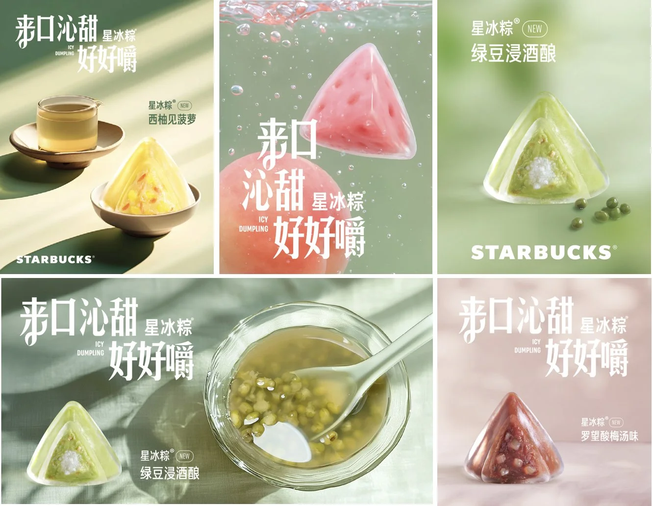
This summer, we launched a seasonal campaign for Starbucks China, introducing a colorful series of iced zongzi (Icy dumplings) in six refreshing flavors. Inspired by traditional Dragon Boat Festival treats, our design system merges nostalgic flavor memory with a playful visual language tailored to younger consumers.
As the campaign’s lead designer, I developed the overall visual system and art direction, from hero key visuals to digital assets and in-store print applications. We explored vibrant color blocking, stylized flavor cues, and multi-dimensional food photography to emphasize product freshness and cultural roots while maintaining Starbucks’ clean aesthetic. The playful zongzi shapes became an instant hit, boosting consumer engagement and seasonal product visibility both online and in-store.
Digital &Print Assets Overview
To clearly distinguish between the visual strategies for digital and print applications, we developed two asset systems:


Digital Assets:
Realistic glass tableware and juicy food photography to emphasize freshness and appetizing texture for online promotion.
Print Assets:
Stylized gradient bowls and illustrated ingredients designed for scalable offline printing, adding a soft, seasonal charm.
Digital Assets

I adapted the hero visual into digital assets for social media, website banners, and e-commerce platforms. We optimized layouts for different platforms, ensuring visual consistency while highlighting each flavor’s uniqueness. Each digital touchpoint emphasized the product’s cooling and juicy qualities through high-contrast compositions and expressive typography.
Print Assets
To make the campaign feel more complete in stores, I designed print materials like posters, signs, and an envelope for the Icy Dumpling voucher. Everything followed the same visual style and could be used in different store sizes while keeping the brand feeling consistent.
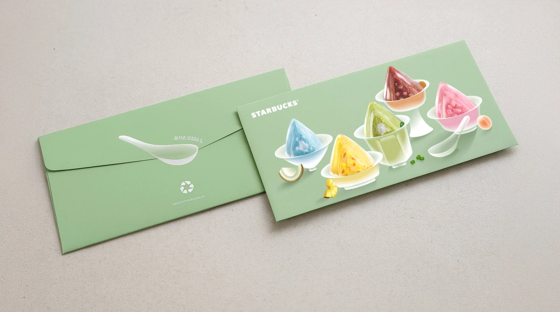
Icy dumpling voucher

Giftcard
Digital Adaptation Inspiration & Reference
Key visuals for digital adaptation emphasized keywords such as light reflection, juiciness, and freshness, captured through photography. It was recommended to use realistic images that highlight these qualities as the background, paired with clean white typography to enhance the appetizing look and align the visual language across platforms.